Typography
Typography in Prism is purpose driven. You pick a role (what the text does) and the token sets size, line height, and weight for you.
Typography roles
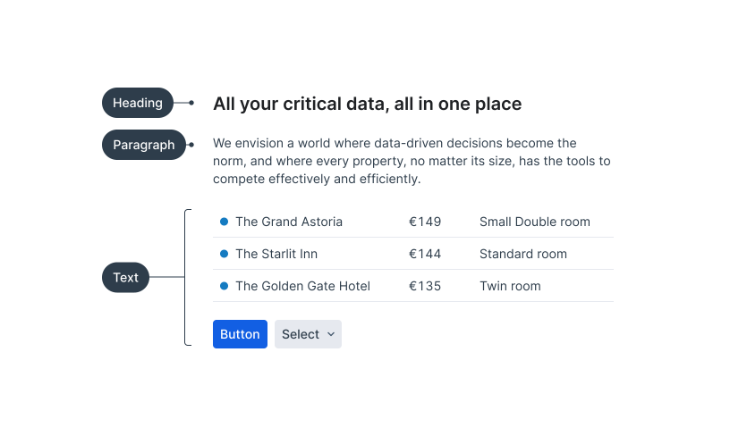
Roles give each type style a fixed purpose. Pick the role that matches what the text does, not how big it should look. Prism’s type system is built on Inter, with one role per token category: heading, paragraph, and text.
Heading
Creates hierarchy within components, patterns, and pages. Not for emphasis. Use a heading only when it introduces the content below it.
.heading-{1–4} 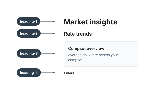
Paragraph
For bodies of text that are read rather than scanned: messages, descriptions, and longer explanations. Larger line heights give more reading comfort. Not for UI elements. The extra line height costs vertical space in controls and tables.
.paragraph-{size}--{weight} 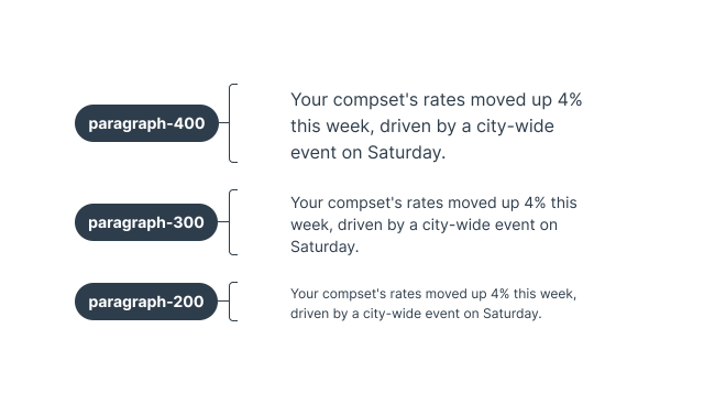
Text
For UI elements: labels, values, table data, and metric blocks. Condensed line heights save vertical space and keep interfaces easy to scan. Not for long reading. If it runs past a few lines, switch to paragraph.
.text-{size}--{weight} 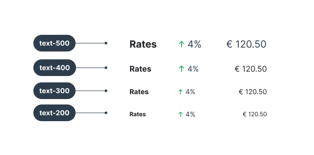
Typography properties
Three properties apply across every role. Line height and weight are built into each token; tabular figures are switched on wherever numbers need to line up.
Line height
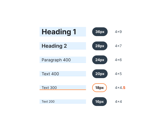
Line heights sit on the 4px baseline grid, with one deliberate exception: 18px, used by text-300 and paragraph-200, lands on the 2px half-step. Here, readability wins over grid rigidity.
Weights
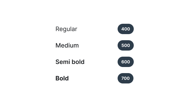
Headings come in a fixed weight: bold for .heading-1, semi-bold for the rest. Paragraph and text styles adapt to their context, so every size is available in regular, medium, semi-bold, and bold. Medium is only for actions and navigation: buttons, links, and navigation items. The token table below lists the recommended pairings.
Weight in dark themes
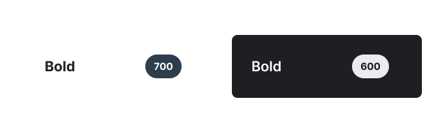
Light text on a dark background looks heavier than dark text on a light one. To keep bold looking the same in both, it drops from 700 to 600 in the dark themes.
Tabular figures
These figures have a uniform width, which makes them an ideal choice for presenting numerical data in tables. The Table component applies them automatically.
Elsewhere, use tabular figures only for numeric data related to size (e.g., percent, count, price). Don’t use them for numeric data unrelated to size (e.g., date, zip code).
font-variant-numeric: tabular-nums 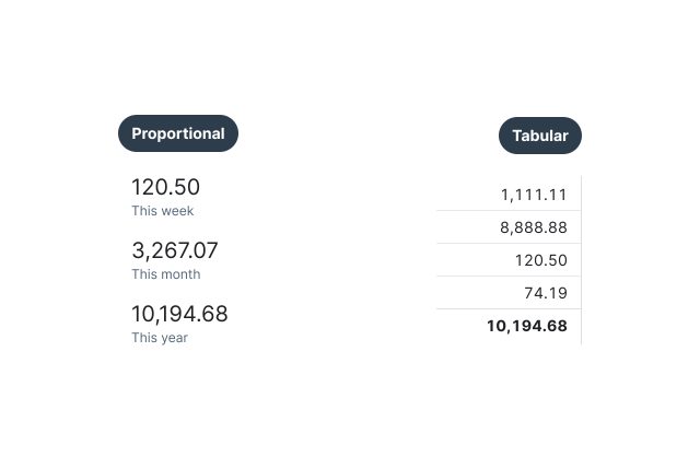
Tokens
The recommended class for each role, with its size, line height, and weight. Native h1–h4 elements pick up the matching heading style without a class.
Need just one property? Use the CSS variable behind the class:
.text-300--regular {
  font-size: var(--prism-font-size-text-300-regular);
  font-weight: var(--prism-font-weight-text-300-regular);
  line-height: var(--prism-font-line-height-text-300-regular);
}| Class | Style | Usage |
|---|---|---|
.heading-1 | 28px / 36px · Bold | Page titles |
.heading-2 | 20px / 28px · Semibold | Section titles, modal headers |
.heading-3 | 16px / 24px · Semibold | Subsection titles, card headers |
.heading-4 | 14px / 20px · Semibold | Small headings, sidebar titles |
.paragraph-400--regular | 16px / 24px · Regular | Long-form body text |
.paragraph-300--regular | 14px / 20px · Regular | Secondary body text, descriptions |
.paragraph-200--regular | 12px / 18px · Regular | Captions, footnotes |
.text-500--regular | 20px / 24px · Regular | Large UI text, featured content |
.text-400--regular | 16px / 20px · Regular | Default UI text |
.text-400--bold | 16px / 20px · Bold | Emphasized UI text |
.text-300--regular | 14px / 18px · Regular | Secondary UI text, form hints |
.text-300--bold | 14px / 18px · Bold | Emphasized secondary text |
.text-200--regular | 12px / 16px · Regular | Helper text, timestamps |
.text-200--bold | 12px / 16px · Bold | Emphasized helper text |
.text-400--medium | 16px / 20px · Medium | Large links |
.text-300--medium | 14px / 18px · Medium | Buttons, links, navigation and breadcrumb items |
.text-200--medium | 12px / 16px · Medium | Small buttons and links |