Spacing
Spacing in Prism is purpose driven. You pick a step by what the space does (inside a component, around content, or a component's size) and the 4px scale keeps it all in rhythm.
Spacing scale
Every space in Prism comes from one scale built on a 4px base unit. The number in the token name grows with its value: spacing.100 is 4px and spacing.400 is 16px. spacing.50 is a 2px half-step for the tightest spots.
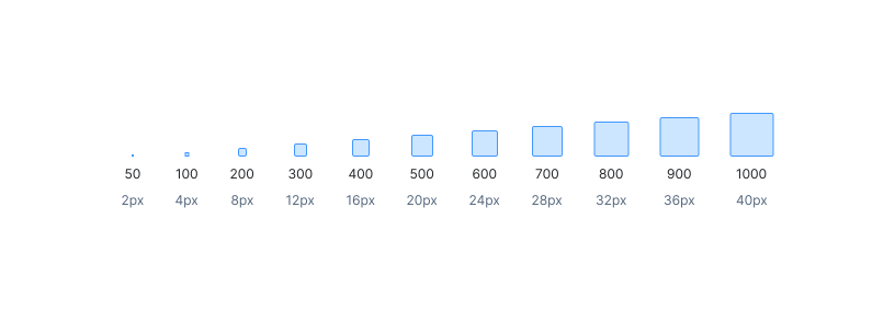
How spacing is used
Pick a step by what the space does, not by how it looks. Small steps hold a component together, medium steps give content room, and the same scale sets the size of components and icons.
Inside components
Padding and gaps within a single component: around a button’s label, between an icon and its text, inside a badge. Not for layout. These steps are too tight to separate blocks of content.
spacing.50 – spacing.300 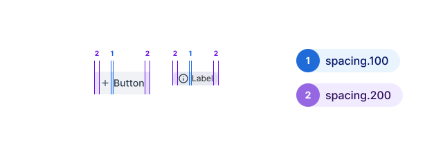
Around content
Padding inside containers and gaps between content blocks: card headers and bodies, the first and last table columns, list items, drawer footers. Not for component internals. At this size, the parts of a single control drift apart.
spacing.300 – spacing.500 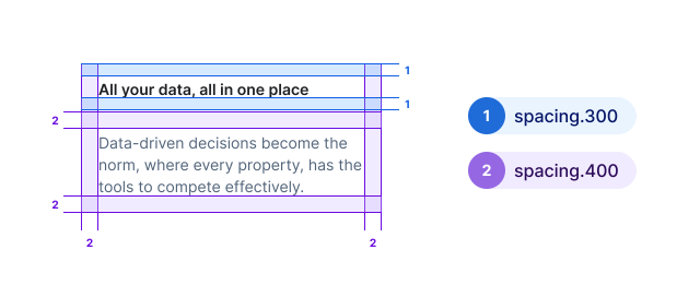
Component sizes
Heights and icon sizes come from the same scale, so components line up with the space around them. Buttons, inputs, and selects are 32px by default and 24px small; large buttons are 40px. Icons are usually 12px to 24px. Sizes, not spacing. These steps mostly set dimensions; for padding, reach for the smaller steps first.
spacing.300 – spacing.1000 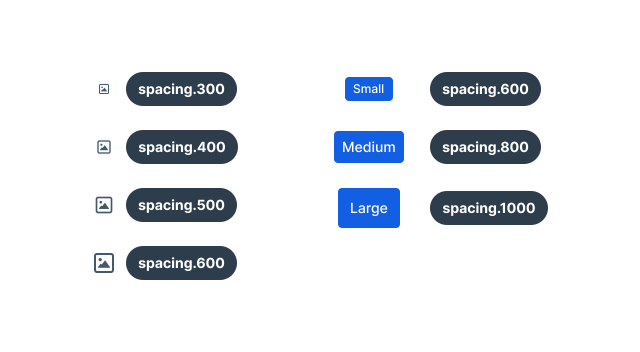
Tokens
Every spacing token, with its value and where Prism components use it. Use the CSS variable in code. The token name is what you’ll find in Figma.
| CSS variable | Figma token | Value | Common uses |
|---|---|---|---|
--prism-spacing-0 | spacing.0 | 0 | Explicit reset |
--prism-spacing-50 | spacing.50 | 2px | Badge and input padding, border widths, focus outline offset |
--prism-spacing-100 | spacing.100 | 4px | Gap between icon and label, tight padding in selects |
--prism-spacing-200 | spacing.200 | 8px | Button side padding, gaps between grouped controls, table cells |
--prism-spacing-300 | spacing.300 | 12px | Card header, banner, and toast padding; extra-small icons |
--prism-spacing-400 | spacing.400 | 16px | Card sides and body, first and last table cell; small icons, checkboxes |
--prism-spacing-500 | spacing.500 | 20px | List gaps, drawer footer padding; medium icons |
--prism-spacing-600 | spacing.600 | 24px | Small button, input, and select height; large icons |
--prism-spacing-700 | spacing.700 | 28px | – |
--prism-spacing-800 | spacing.800 | 32px | Default button, input, and select height; table header row |
--prism-spacing-900 | spacing.900 | 36px | Table row height, alert padding |
--prism-spacing-1000 | spacing.1000 | 40px | Large button height, navigation menu items |