Shadow
Shadow in Prism is purpose driven. You pick a level by how far a surface sits above the page (resting, floating, or top layer) and the token sets the depth for you.
Shadow levels
Shadow shows how far a surface sits above the page. Prism has three levels: the higher the number, the deeper the shadow and the higher the surface. A fourth token, shadow.neutral.inset, works the other way and presses a control into the page.
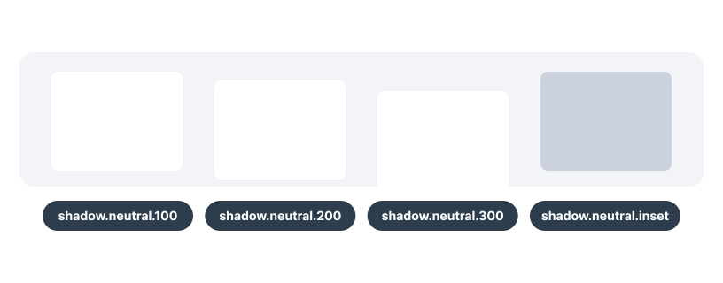
How shadow is used
Pick a level by where the surface sits, not by how much it should stand out. Most of the page has no shadow at all; shadow is for the few surfaces that sit on top of it.
Resting surfaces
A subtle lift for surfaces that sit on the page: cards, and the selected item in a toggle group. Not for floating layers. It is too subtle to separate an overlay from the content below it.
shadow.neutral.100 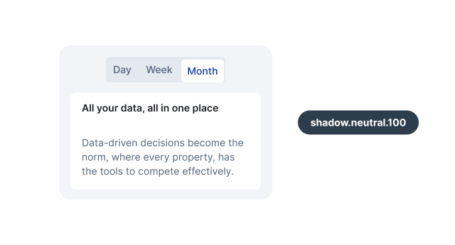
Floating layers
Layers that open above the page and close again: popovers, select and combobox lists, navigation menus, and drawers. Not for content in the page flow. A card with this shadow reads as something that opens and closes.
shadow.neutral.200 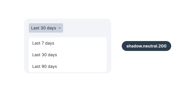
Top layer
The deepest shadow, for modals and toasts. Not for menus or popovers. Keep it for what needs attention first, so it stays on top.
shadow.neutral.300 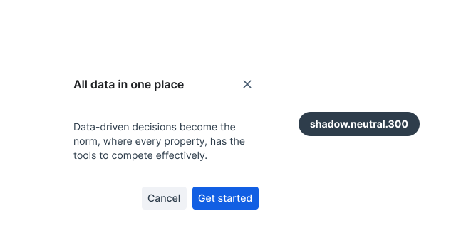
Pressed
An inner shadow while a button, checkbox, or radio is pressed, so the control feels pushed in. Not at rest or on hover. It only shows for as long as the control is held down.
shadow.neutral.inset 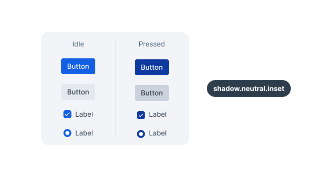
In dark themes
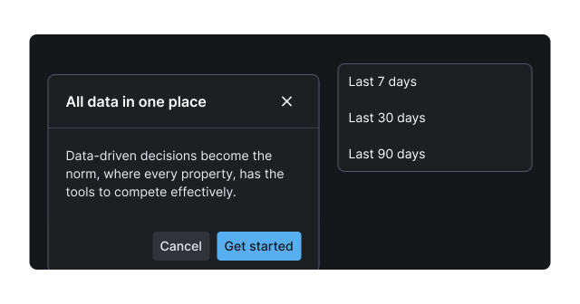
A drop shadow is hard to read on a dark background, so the dark themes pair it with a thin light ring around the surface. shadow.neutral.100 drops the shadow entirely, so cards stand apart by surface color alone. In high-contrast dark, all three levels become the same 1px ring. Use the same tokens. The theme makes the swap; don’t hard-code a ring or a heavier shadow.
Tokens
Every neutral shadow token, what it looks like in the light theme, and where Prism components use it.
| CSS variable | Description | Common uses |
|---|---|---|
--prism-shadow-neutral-100 | Two soft layers, 1px down, barely visible | Card, selected toggle group item |
--prism-shadow-neutral-200 | Two layers, up to 8px down with a 12px blur | Popover, select and combobox lists, navigation menu popup, drawer |
--prism-shadow-neutral-300 | One deep layer, 24px down with a 48px blur | Modal, toast |
--prism-shadow-neutral-inset | Inner shadow, 2px down with a 4px blur | Pressed button, checkbox, radio, and checkbox group item |