Design Tokens
Design tokens in Prism are the shared names behind every style. You pick a token by what it's for, and the theme fills in the value.
Token layers
Color and typography come in two layers. Base tokens hold the raw palette; alias tokens give those values a purpose. In code, you use tokens as CSS variables.
From value to component
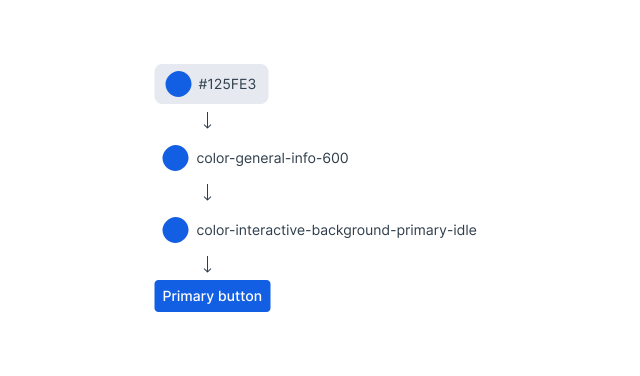
Take the primary button in the light theme. The base token color.general.info.600 holds the value #125fe3. The alias token color.interactive.background.primary.idle points to that base token, and the button uses only the alias. Change the base value, and every alias that points to it follows.
How tokens are used
Pick a token by what it’s for, not by the value it has today. Values change with the theme and over time; the name stays the same.
Base tokens
The raw palette behind every color. Each color has a ramp of numbered steps, from 50 to 950: neutral, brand, info, success, warning, critical, and intelligence. A step says how light or dark a color is, not what it’s for. Some colors also have translucent alpha steps for surfaces that sit on top of others. Not picked directly. You reach a base token through an alias, which decides where each step is used.
--prism-color-general-{color}-{step} 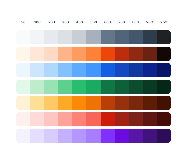
Alias tokens
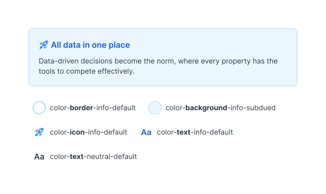
The tokens you use in UI. Each one points to a base token and names the job it does: a critical background, a default border, a hovered button. Pick by job, not by color. If two aliases share a value today, still use the one whose name fits. A theme can point them at different base tokens.
--prism-color-background-critical-default Scale tokens are the exception. Spacing, shadow, and border radius have no alias layer, so you use the scale step directly. Still write var(--prism-spacing-400), not 16px, so the step can change in one place.
Themes
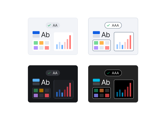
Prism has four themes: light, dark, and a high-contrast version of each. A theme can change a base token’s value, or point an alias at a different base token. Same token, every theme. Don’t check the theme in code to pick a different token.
Token naming
Names read from general to specific. Read the name, not the value. If the name fits what you’re styling, the token is right in every theme.
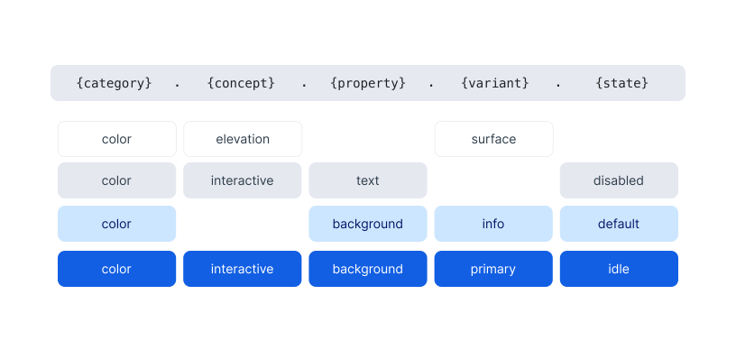
A name leaves out the parts it doesn’t need, but the order never changes. Interactive states are idle, hover, pressed, selected, and disabled, plus focus for borders and placeholder for text; other tokens use default, emphasis, or subdued. Spacing, shadow, and border radius use a shorter name: the category and a step, such as spacing-400. Shadow adds a color, as in shadow-neutral-200. Chart colors, gradients, and typography follow their own patterns; see Data visualization and Typography.
Token categories
Every token category, the prefix its CSS variables start with, and where it’s covered in detail.
| Category | CSS variable prefix | Layers | Covered on |
|---|---|---|---|
| Color | --prism-color- | Base and alias | Color |
| Chart color | --prism-color-chart- | Base and alias | Data visualization |
| Gradient | --prism-gradient- | Alias, built from base colors | – |
| Typography | --prism-font- | Base (not in CSS) and alias | Typography |
| Spacing | --prism-spacing- | Single | Spacing |
| Shadow | --prism-shadow- | Single | Shadow |
| Border radius | --prism-border-radius- | Single | – |
Tokens in code
Tokens ship in the @mylighthouse/prism-foundation package. Style Dictionary builds them into CSS variables, with one set per theme, and into a Tailwind theme. Import one stylesheet once and every theme is available. Light is the default; set data-theme on the root element to dark, highcontrast-light, or highcontrast-dark to switch. Apps that use Tailwind import the Tailwind stylesheet instead, which includes the CSS variables.
| Output | Path in the package |
|---|---|
| CSS variables | styles/prism-foundation.css |
| CSS variables and Tailwind | styles/tailwind.css |
| Raw tokens (Style Dictionary JSON) | tokens/ |