Color
Color usage in Prism is purpose driven. You pick a role (what the color means) and a property (where it goes). The system behind it handles light, dark, and high-contrast for you.
Color roles
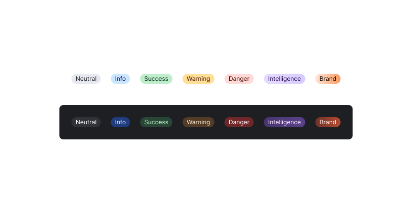
Roles give each color group a fixed semantic meaning. What changes across themes is the value behind the token, not the token itself.
Neutral
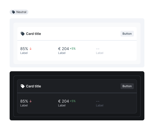
The default for structure, text, borders, and surfaces: everything that isn’t communicating a state. Don’t reach for a saturated status role just to add emphasis; Neutral keeps status colors legible by not competing with them.
Info
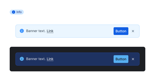
The default accent for primary actions and directing attention when no status is implied. Not a generic “blue.” If it signals success, warning, or error, use that status role instead.
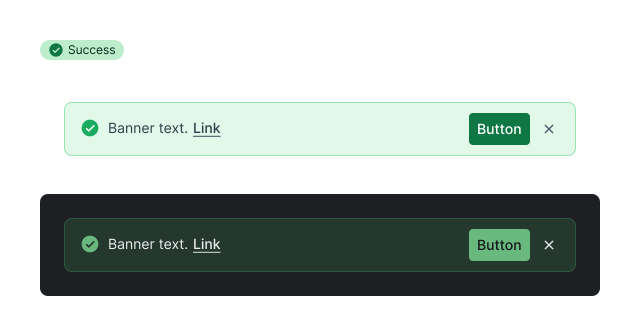
Success
Confirms a positive outcome: completion, approval, or a healthy system state. Only for genuine system states, not decorative “active/on” styling.
Warning
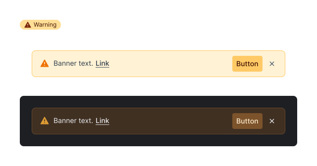
Flags a non-blocking condition that needs attention before proceeding. Not for errors. If the action is blocked or failed, that’s Critical, not Warning.
Critical
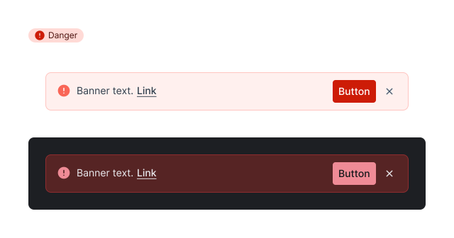
Signals an error, failure, or destructive action that demands immediate attention. Never for emphasis. Red that doesn’t mean “something is wrong” erodes the signal everywhere else.
Intelligence
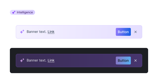
Distinguishes AI-generated content and surfaces from standard UI. Not a decorative accent. Reserve it for genuinely machine-generated features. AI-generated surfaces get their own visual logic (a translucent purple that tints whatever it sits on), so “the machine made this” is legible without a label.
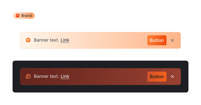
Brand
Not for general-purpose emphasis. Reserve Brand for hero surfaces, brand-primary buttons, and marketing-adjacent UI; use Info for everyday accents.
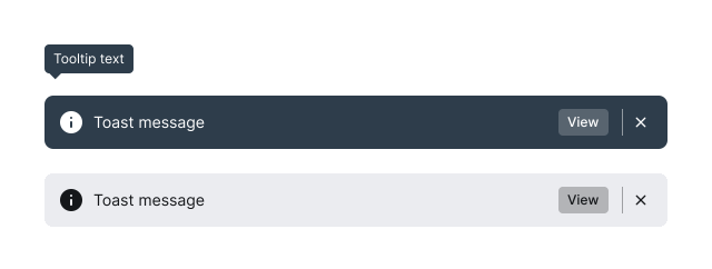
Inverse
High-contrast surfaces placing light text, icons, and borders on a dark background, for banners, tooltips, and overlays that need to stand out against a light surface. Not a dark theme. It’s a local high-contrast surface, not a global mode.
Color properties
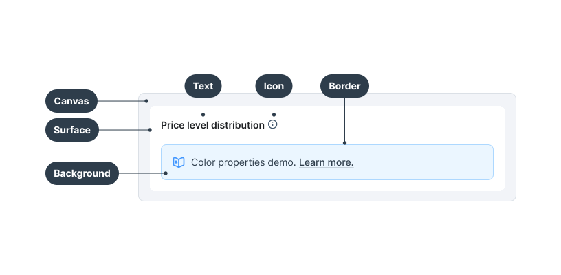
Color is applied via design tokens across the following properties. Each section below shows when to use the property, the token structure, and how levels (subdued, default, emphasis) create hierarchy within a role.
Elevation
Canvas
The main background of all UI in Lighthouse. Everything sits on top of Canvas.
color.elevation.canvas
Background subdued
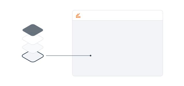
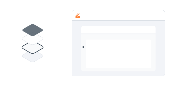
A background token used as the base layer for nested card layouts, sitting below Surface in the visual stack. This is not a standard elevation token. It exists to solve the specific case where cards need to nest without losing depth.
color.background.neutral.subdued
Surface
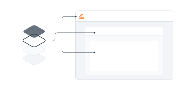
The default raised background for cards, navigation, and other prominent elements.
color.elevation.surface
Backdrop
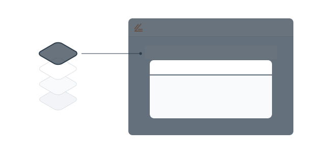
Semi-transparent dark overlay behind modals and dialogs.
color.elevation.backdrop.default
Background color
Default
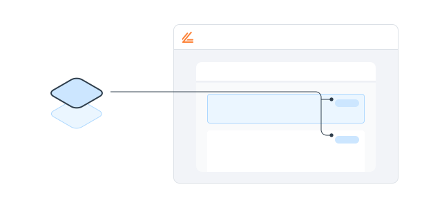
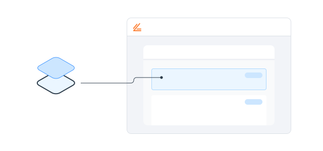
Background color for status elements like badges. Can sit on top of surfaces and subdued backgrounds in the same color role.
color.background.{role}.default
Subdued
Background color for status elements like banners. Requires a matching default border in the same color role for sufficient contrast on Surface or Canvas.
color.background.{role}.subdued
Border color
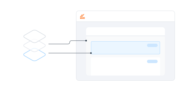
Borders create structure and organization in data tables, card headers, and banners. They visually separate and contain elements.
Default
Standard border for separating and containing elements. Used in cards, table rows, and input fields. Each color role has a default border.
color.border.{role}.default
Emphasis
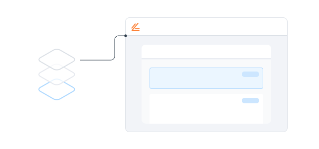
High-contrast border for stronger visual separation. Used in card headers, active states, and dividers that need to stand out against the surface.
color.border.{role}.emphasis
Icon color
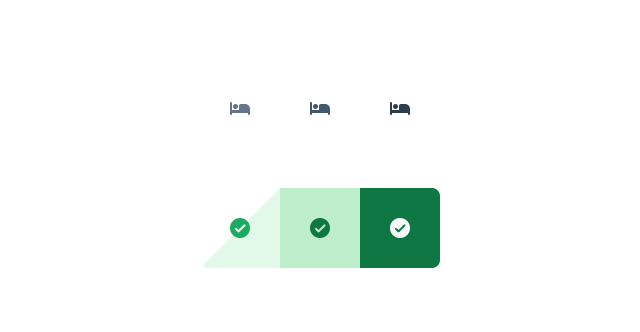
Use icon colors with their paired background and on Surface. Each role follows the same three levels.
Subdued
Secondary icon color for lower-emphasis contexts. Use when an icon supports content but should not compete with primary elements.
color.icon.neutral.subdued
Default
Standard icon color for each color role. Meets contrast requirements on its paired background and on Surface.
color.icon.{role}.default
Emphasis
High-contrast icon color for maximum prominence. Pair with emphasis text tokens on default backgrounds.
color.icon.{role}.emphasis
Text color
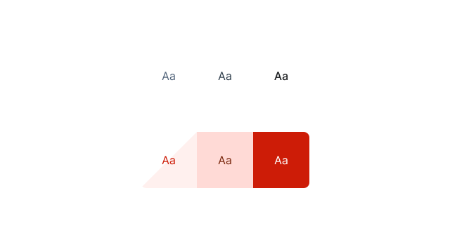
Text colors meet contrast requirements on their paired background and on Surface. Each role follows the same three levels.
Subdued
Secondary text color for supporting content, captions, and metadata. Meets contrast requirements on Surface.
color.text.neutral.subdued
Default
Standard text color for body copy and labels. Meets contrast requirements on its paired background and on Surface.
color.text.{role}.default
Emphasis
High-contrast text for headings and prominent labels. Use for maximum readability against Surface or subdued backgrounds.
color.text.{role}.emphasis
Interactive colors
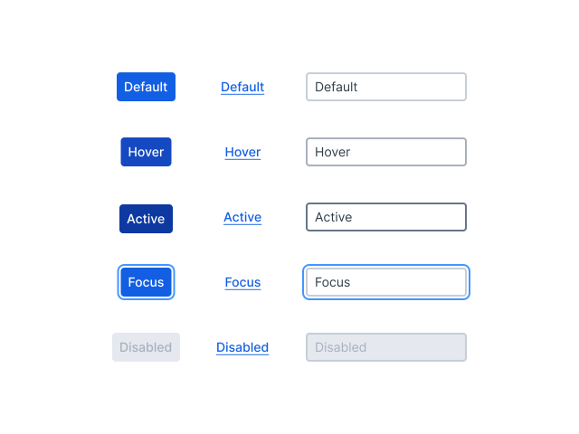
Interactive colors add a layer of interaction states on top of the base properties: idle, focus, hover, pressed, selected, disabled, and placeholder. Each state resolves per role, so a component keeps its meaning while responding to interaction.
Background
Primary and status actions use darker shades to stand out. Secondary and tertiary actions use lighter neutrals to keep the interface balanced.
color.interactive.background.{role}.{state}
Text
Primary links use Info-blue as standard. Secondary links use neutral tones for lower-emphasis areas.
color.interactive.text.{role}.{state}
Border
Focus states use Info-blue for consistent tab navigation. Neutral tones for default, hover, and pressed. Critical and Warning keep their color roles, with darker shades for hover and pressed.
color.interactive.border.{role}.{state}